In the previous post about the course, I shared a few works by our great students at Aalto University. They were all from the first assignment, Improve Wikipedia!
The second assignment was Visualizing Democracy. Every student would pick a facet of the democratic process or a related phenomenon in his or her home country and produce a visualization. The idea was to go for a deep analysis so that the end result wouldn’t be a simple graphic of a party’s membership roster, for instance. We gave the option to make a poster, animation or an interactive visualization. I won’t show all of the works here due to technical limitations, but here are a few examples of what the students came up with.
(click images to enlarge)
India is a huge country and the scale of misappropriated funds is equally massive. Prashant Coakley made this chart showing the ten biggest scandals by monetary value.
The Parliamentary Ombudsman is a very Nordic public office that deals with citizens’ grievances with officials. This visualization by Unto Helo shows how many of these claims led to action being taken.
Finland has an exceptionally long history of women in politics. In this poster by Irmeli Iivonen, female Members of Parliament are color-coded based on party affiliation.
Emilia Ahonen designed this ambitious timeline of the rulers of Finland, reaching back to the earliest (somewhat) reliable figures. It ended up being too wide for a regular poster, but the scope was so impressive that we didn’t mind.
The population pyramid is a well-established way to demonstrate the age structure of a population. Jutta Joutjärvi uses it in her poster to show how the Parliament and its member parties and parliamentary groups differ from the age structure of Finland itself. I had thought of the Social Democrats as a party of old men, but apparently this is not true (at least for MPs).
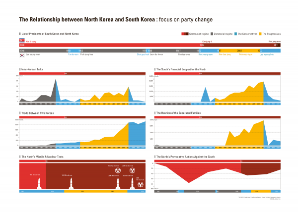
The problematic relationship between the two Koreas is illustrated in this set of timelines by Jinhee Kim. The period labeled with yellow was marked by the Sunshine Policy, an effort by the Republic of Korea to seek cooperation with the Juche regime.
(click on the image to start visualization)
Antti Vuorela created this interactive display that maps the ebb and flow of Finnish politics from 1945 to 2011. In addition to changes in the number of Parliament seats, it shows how parties move between the government and the opposition. None of the major ones are truly perpetual cabinet parties. Antti is refining this further, so I’ll update this entry when the next version is done.


