Student projects from our course at Aalto, spring 2018

We teach the course “Information Design II” as a part of the the Information Design track of the Master studies in Visual Communication Design at Aalto university. This year we gave our students the following open brief:

Pick a subject of interest and gather data about it. You may also choose to continue your project from Information Design I.

Study your subject carefully and develop a way to explain and represent it visually. You can focus on a particular aspect or strive to give a broader overview of the topic in question. Your work should include several graphics and represent both qualitative and quantitative (numerical) information.

Here’s a selection of interesting projects that were created during the course. Click images to enlarge.

Yentsen Liu: StatFin Database interface redesign


Yentsen did a thorough review of Statistics Finland’s PX-Web database interface and worked on a suggestion for a more usable and contemporary redesign. You can read a comprehensive explanation of the project here: blog.yentsenliu.com/redesign_statfin

Helén Marton: (Mis)informed


Helén developed a concept for an online platform called (Mis)Informed. The purpose for the site is to combat misinformation by:
– hosting a public library of bad, misleading or straight-up deceiving information graphics/visualizations
– by offering educational material to assist in developing a critical eye when viewing graphics.
Helén is currently looking for collaborators to take this project further. Contact her via e-mail: mail{at}helenmarton.com

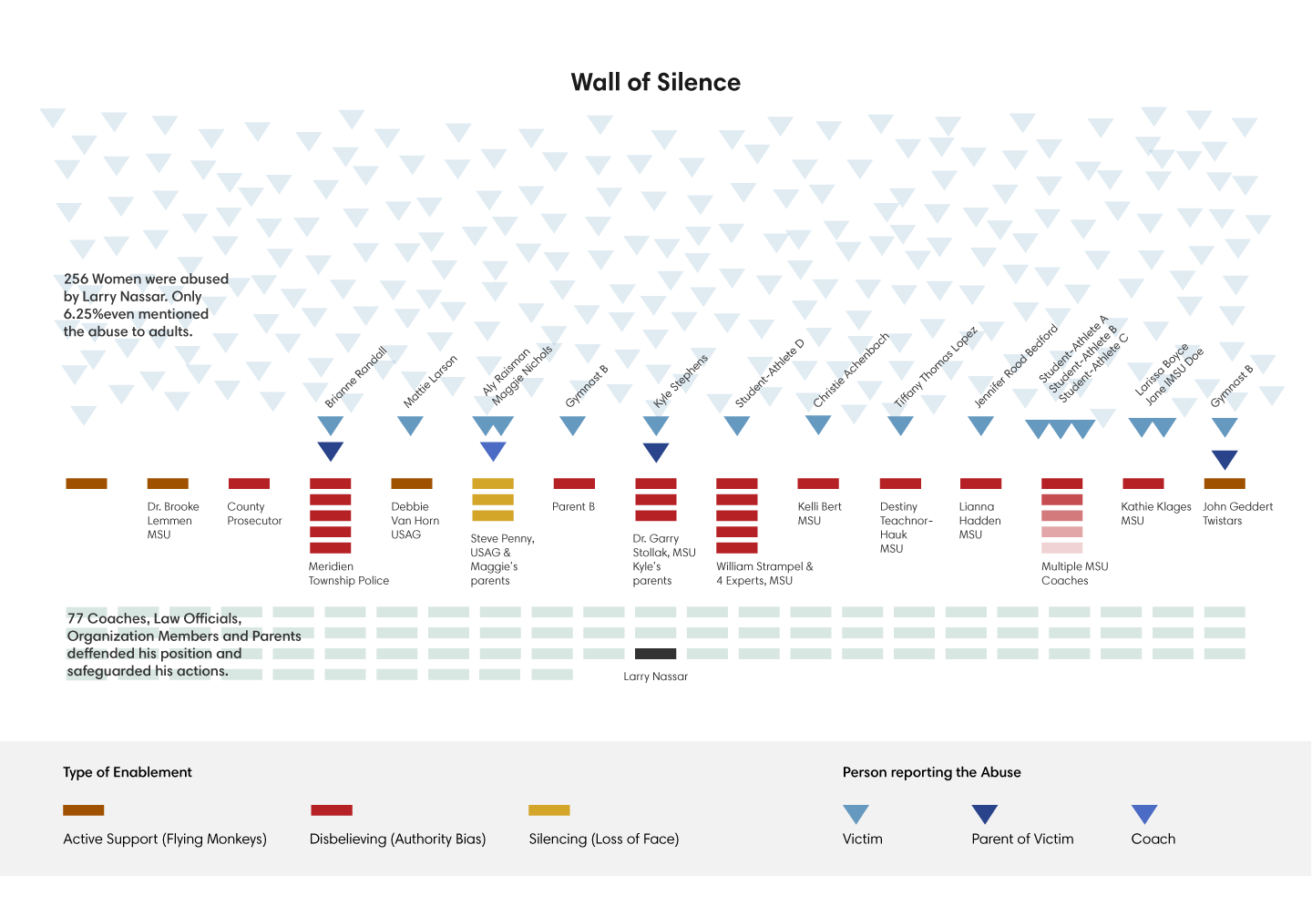
Adina Renner: Flying Monkeys and a Wall of Silence


Adina wrote and designed a sketch for a thoughtful web article about how young athletes were systematically abused by the physician Larry Nassar. The goal was to make visible the web of connections, that made the abuse possible and allowed it to continue for years.

Lilla Tóth: When Hollywood says ‘I love you’

Chart of mentions of the term ”i love you” in hollywood films
Lilla used a collection of Hollywood movie scripts to investigate when – and how many times – male and female actors utter the words ‘I love you’ in different films.
Lilla’s portfolio is at behance.net/lillatoth

Liam Turner: Tracing the origins of California city names


Liam created an elegant map that looks at the historical and thematical origins of city names in California.
Liam’s portfolio is at califjordia.com

Conflict: Student works from our course in Aalto 2014

Apologies for the long radio silence, it has been busy times! Just before Christmas, we finished another round of our long-running course Information Design  at Aalto University. Now the assignment for the main project was the following:

“Choose a subject that fits under the topic ‘conflict’. Study your subject and find a way to explain and represent it visually.”

The project started in the end of September and working continued throughout the course. Every student was to find their own way of approaching the topic and look for relevant data sets to work with. The challenge was to find a way of representing data relating to the chosen subject that would show both qualitative and quantitative (numerical) information. To allow for a variety of subjects the final presentation format was deliberately left rather open.

(click images to enlarge)


Ebola_in_the_News

Lisa Staudinger made this very detailed poster on how the news coverage of the ebola epidemic in a number of online newspapers corresponded to the number of cases and deaths. Key events that appear to drive media interest are marked on the graphs. At the bottom is a small multiples graphic comparing Google trends to media coverage. Lisa’s portfolio is at www.behance.net/LisaStaudinger


Mustafa_Armstrade
(Click the image to launch the interactive visualization)
Mustafa Saifee did an impressive job of visualizing global arms trade data with an interactive Sankey diagram created using the Javascript libraries Paper.js and D3. It is striking to note how few countries import big amounts of arms from both Russia and the United States, India being the major exception. Mustafa’s portfolio: mustafasaifee.com


Information Design Marija Erjavec_expanded

Marija Erjavec used Finnish food waste statistics to create a decision tree poster, that allows the reader to determine her or his average food waste and the amount of food wasted in different categories. Surprisingly, the amount of food waste appear to depend on if the buyer is male or female. Marija’s portfolio: www.behance.net/marijaerjavec


small-grid_18x24_un_1

Akbar Khatir’s poster is a timeline of the United Nations. It shows how the UN has expanded and the dynamics of the Security Council voting. One can amongst other things see the ebb and tide of council vetoes during the Cold War and a big increase in the total number of resolutions with the dissolution of the Soviet Union. On the left the Secretary Generals are listed. Akbar’s portfolio: cargocollective.com/akbar, contact via e-mail: akbar.khatir(at)gmail.com


Information design_maja tisel

Maja Tisel did a more artistic project on the conflict between daylight and night – evident in the long, dark winters in Finland. In addition to the poster, she made an interactive graphic in Paper.js based on the same data. It can be viewed here.