Student projects from our course at Aalto, spring 2018

We teach the course “Information Design II” as a part of the the Information Design track of the Master studies in Visual Communication Design at Aalto university. This year we gave our students the following open brief:

Pick a subject of interest and gather data about it. You may also choose to continue your project from Information Design I.

Study your subject carefully and develop a way to explain and represent it visually. You can focus on a particular aspect or strive to give a broader overview of the topic in question. Your work should include several graphics and represent both qualitative and quantitative (numerical) information.

Here’s a selection of interesting projects that were created during the course. Click images to enlarge.

Yentsen Liu: StatFin Database interface redesign


Yentsen did a thorough review of Statistics Finland’s PX-Web database interface and worked on a suggestion for a more usable and contemporary redesign. You can read a comprehensive explanation of the project here: blog.yentsenliu.com/redesign_statfin

Helén Marton: (Mis)informed


Helén developed a concept for an online platform called (Mis)Informed. The purpose for the site is to combat misinformation by:
– hosting a public library of bad, misleading or straight-up deceiving information graphics/visualizations
– by offering educational material to assist in developing a critical eye when viewing graphics.
Helén is currently looking for collaborators to take this project further. Contact her via e-mail: mail{at}helenmarton.com

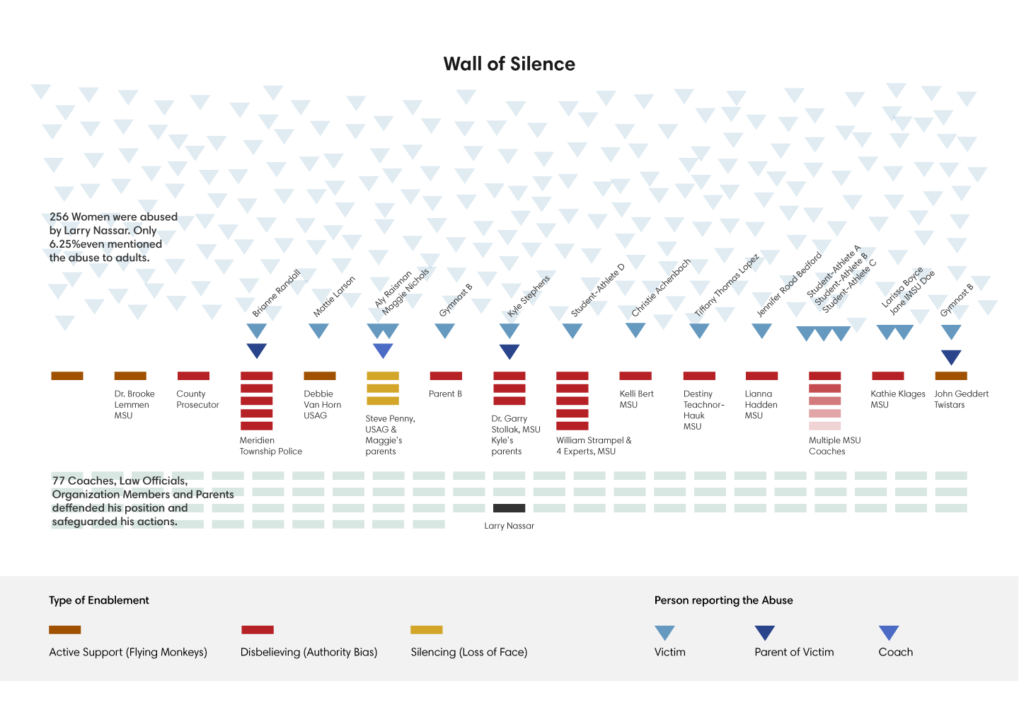
Adina Renner: Flying Monkeys and a Wall of Silence


Adina wrote and designed a sketch for a thoughtful web article about how young athletes were systematically abused by the physician Larry Nassar. The goal was to make visible the web of connections, that made the abuse possible and allowed it to continue for years.

Lilla Tóth: When Hollywood says ‘I love you’

Chart of mentions of the term ”i love you” in hollywood films
Lilla used a collection of Hollywood movie scripts to investigate when – and how many times – male and female actors utter the words ‘I love you’ in different films.
Lilla’s portfolio is at behance.net/lillatoth

Liam Turner: Tracing the origins of California city names


Liam created an elegant map that looks at the historical and thematical origins of city names in California.
Liam’s portfolio is at califjordia.com

Some thoughts on interactivity and storytelling

Two somewhat intertwining themes in many of the presentations at this year’s Malofiej conference (and last year as well) were what role interactivity and storytelling should play in data visualization. I think these two issues are related, and both of them are extremely important for our profession.

New York Times’ Archie Tse memorably told the conference (in 2016) that “readers just want to scroll” and that “if you make the reader click or do anything other than scroll, something spectacular has to happen.” That is, most of the visitors on a newspaper’s site don’t deeply interact with the graphics on the site, but instead prefer to just scroll and treat the interactive visualizations as static pictures.

Gregor Aisch published today a blog post titled “In defense of interactive graphics” which adds more shades of gray. I found this a particularly salient point: “– – you should not hide important content behind interactions. If some information is crucial, don’t make the user click or hover to see it – –. But not everything is crucial and 15% of readers isn’t nobody.” Another good point he makes is that letting the readers explore the data in detail helps spot mistakes and correct them.

Not all users and all use cases are as important! A sizeable part of my own work consists of doing interactive visualizations for public sector clients. Although the broadly defined target audience might be “anyone interested in the issue” very often there is a much, much smaller core audience, sometimes only a handful of people, whose needs are very different from a random visitor. These might be e.g. MPs who write legislation on the issue my client has a stake in, or experts in the subject matter working in a different arm of government. Such users are often much more invested in the issue to begin with, more knowledgeable on the topic, and more willing to spend time exploring a dataset. These past two days we heard of many examples of projects which may not have been huge hits with readers, but which helped journalists working within the newsroom to find stories. All these are examples of cases where you shouldn’t decide whether the graphic was succesful based only on how the 85% or 99% or users interacted (or didn’t) with it, but also take into account that some users are more valuable to you than others.

This brings us to the issue of storytelling. Jon Schwabish’s presentation discussed the topic at length yesterday, and in response to Jon’s thoughts Chad Skelton made the point in his blog that a literary story is different from a news story. I think this is true and important, but I would still  argue a news story is called a “story” for a reason.

A story is defined in the dictionary as “an account of imaginary or real people and events told for entertainment”, “a piece of gossip; a rumour” – or even “a false statement; a lie”. (In a Finnish newsroom, likewise, a news story is called juttu; literally an anecdote, a yarn, even a joke.) The common theme here is that “a story” includes at least a somewhat subjective point of view, and a narrative arc, with which the writer or speaker ties a bunch of disparate facts together as a coherent explanation of a part of the world, whether or not that explanation is true. (Nathaniel Lash also touched on this issue in his presentation today.) A table of numbers is not a story (though a data journalist might see a story in that table), nor should an entry in a dictionary or encyclopedia be.

I found Anna Flagg’s presentation today extremely relevant for very many reasons, but one issue she discussed I want to specifically mention here was the question of perceived bias in journalism and how to combat that perception. She mentioned a survey according to which in the U.S., a whopping 71% of Trump supporters and even 50% of Clinton supporters wanted the media to report just the facts without including any interpretation their own. As professionals, we understand that, if taken literally, such reporting would probably not be possible and certainly not very useful. Nevertheless, these numbers are indicative of mistrust in the capacity and willingness of the media to report the facts fairly.

I would argue that part of the problem here is that we think of what we are doing as storytelling. A story is a structure which helps to connect disparate pieces of information (factual or not) into a coherent whole, to better understand and remember it. But what if those pieces, even if true, do not objectively fit into a coherent whole? How do we guard against the temptation of seeing a story where there isn’t one in reality? The journalistic code of ethics helps in weeding out intentionally misleading and plain sloppy reporting. I’m not sure it helps as much when the problem is journalists seducing themselves with their own stories.

This brings us back to the issue of interactivity. A non-interactive story is just that, a story – a necessarily somewhat subjective narrative arc tying up the facts into a coherent whole. Such a story can be informative and useful, but it is not transparent.

To add transparency to a data-driven story, add interactivity. Instead of showing just the portion of the data the journalist thinks is most relevant for the readers, let them explore the rest as well – if they so prefer. It seems most readers won’t take up the offer; despite saying they want just the facts without interpretation, based on New York Times’ experience most people seem to prefer the journalist’s interpretation of the data to exploring it on their own. But the minority who is interested in and willing to explore the data exists. We should cater to them as well as the majority.

Not only to give them an engaging experience and a better understanding of the world, but also to keep ourselves honest.

Cartograms are hard

This cartogram, purporting to show the indebtedness of Eurozone countries, has been making the rounds on the internet. To me it mostly shows that making cartograms that can actually give the reader any relevent insights is hard, and should be left to specialists.

A cartogram is a map in which the size of the countries (or municipalities, states etc.) do not correspond to their geographical dimensions but instead are scaled according to a different variable, e.g. population. (Stricly speaking, a cartogram is not a map, but in layman’s terms it is.) Truly great cartograms exist, but in my experience, 99 per cent of the time cartograms muddle the data and don’t help gain insights.

This particular cartogram comes from a Deutsche Bank research report (p. 51). The report gives no source, nor any numbers in tabular form, nor even an explanation what the data being shown is. (“Sovereign debt” might mean a variety of things.) The different colors don’t seem to signify anything.

The worst feature of the map is that only Eurozone countries have been rescaled according to debt, whereas non-Eurozone countries (nearly half of the countries shown) retain their original size (but not shape, except for UK). Unless the reader knows all the 19 Eurozone countries by heart (and recognizes their distorted, unlabeled shapes on the map), she can only guess which countries’ sizes show relevant information and which do not.

Making the assumption that the data shown in the original cartogram is public sector liabilities minus assets, per capita (excluding social security funds for better comparability across countries) I downloaded the latest (Q1/2014) available data from Eurostat and created this simple horizontal bar chart.

Edit 23.3.: It would seem that this assumption is wrong. The data shown on the cartogram can’t be liabilities minus assets, whether or not social security funds are excluded, since the Eurostat numbers for those don’t match the relative sizes of the countries on the map. (For example, Belgium should make the top 2 in both cases, but is not in the top 10 of largest countries on the map.) Either the numbers are based on a different definition of sovereign debt, or are plain wrong. I’m guessing the latter, since I can’t imagine a definition of debt which would place Belgium very far from the top among European countries.

(I also collected the data into a single csv file for anyone wishing to create their own visualizations or analyses using the same data.)

Compare the bar chart and cartogram and decide for yourself which gives you more insights about the underlying data. I think the answer is pretty obvious.

Conflict: Student works from our course in Aalto 2014

Apologies for the long radio silence, it has been busy times! Just before Christmas, we finished another round of our long-running course Information Design  at Aalto University. Now the assignment for the main project was the following:

“Choose a subject that fits under the topic ‘conflict’. Study your subject and find a way to explain and represent it visually.”

The project started in the end of September and working continued throughout the course. Every student was to find their own way of approaching the topic and look for relevant data sets to work with. The challenge was to find a way of representing data relating to the chosen subject that would show both qualitative and quantitative (numerical) information. To allow for a variety of subjects the final presentation format was deliberately left rather open.

(click images to enlarge)


Ebola_in_the_News

Lisa Staudinger made this very detailed poster on how the news coverage of the ebola epidemic in a number of online newspapers corresponded to the number of cases and deaths. Key events that appear to drive media interest are marked on the graphs. At the bottom is a small multiples graphic comparing Google trends to media coverage. Lisa’s portfolio is at www.behance.net/LisaStaudinger


Mustafa_Armstrade
(Click the image to launch the interactive visualization)
Mustafa Saifee did an impressive job of visualizing global arms trade data with an interactive Sankey diagram created using the Javascript libraries Paper.js and D3. It is striking to note how few countries import big amounts of arms from both Russia and the United States, India being the major exception. Mustafa’s portfolio: mustafasaifee.com


Information Design Marija Erjavec_expanded

Marija Erjavec used Finnish food waste statistics to create a decision tree poster, that allows the reader to determine her or his average food waste and the amount of food wasted in different categories. Surprisingly, the amount of food waste appear to depend on if the buyer is male or female. Marija’s portfolio: www.behance.net/marijaerjavec


small-grid_18x24_un_1

Akbar Khatir’s poster is a timeline of the United Nations. It shows how the UN has expanded and the dynamics of the Security Council voting. One can amongst other things see the ebb and tide of council vetoes during the Cold War and a big increase in the total number of resolutions with the dissolution of the Soviet Union. On the left the Secretary Generals are listed. Akbar’s portfolio: cargocollective.com/akbar, contact via e-mail: akbar.khatir(at)gmail.com


Information design_maja tisel

Maja Tisel did a more artistic project on the conflict between daylight and night – evident in the long, dark winters in Finland. In addition to the poster, she made an interactive graphic in Paper.js based on the same data. It can be viewed here.


Are carbohydrates really the culprit behind the obesity epidemic?

Obesity is a global health problem. It is obiviously linked to diet in some way, but the exact nature of this link is the subject of volumes of research, and also of heated exchanges online. One school of thought, occasionally exhibiting quasi-religious tendencies in some of its advocates, claims that the obesity epidemic is mainly caused by our diet being too rich in carbohydrates from cereals and other such sources, as well as vegetable oils. As a solution, they advocate changing to a diet rich in animal fats, meat, eggs and so on.

Inspired by the coverage of a recent piece in The Lancet about rising obesity rates, as well as a somewhat uncritical book review in The Economist I decided to see myself if the publicly available data on obesity and diets could be tortured into confessing something on the issue.

I need to emphasize that this is not a scientific study. Describing the methods used as rigorous would be a stretch, to say the least. A few potential problems with the data and with my handling of it are outlined in the end of this article, and the list is by no means exhaustive. What this is, is a bit of light-weight data journalism that will hopefully inspire discussion and possibly more serious research into the data.

I used this WHO data on obesity (the same used by the Lancet authors), combined with agricultural statistics from FAO to see if the number of overweight and obese people in a country was correlated with the intake of various foods.

To capture the effect of changing diets, I used the data from several different years within a single country as separate data points where historical data was available. If you disagree with this choice, you can switch the view to show only the most recent data.

The end result is below, an interactive scatterplot that shows how the consumption of various foods correlates with the number of overweight and obese people in each country. The idea of the visual presentation is that the reader can look at the full dataset and not need to rely on single numbers such as averages or correlation coefficients.

In light of these numbers, there is no evidence that high cereal consumption is linked with obesity on a country level. If anything, the correlation between the share of overweight adults and cereal consumption is mildly negative (r = –0.18). With starchy roots (such as potato) there is no correlation whatsoever (r = 0.08).

The correlation between vegetable oils and overweight is moderate (r = 0.33), though not much greater than with the consumption of animal fats (r = 0.23). It should be noted, though, that the consumption of animal fats is very small in most non-Western countries, so not very many conclusions can necessarily be drawn from this comparison.

The strongest correlation in the data with the share of overweight adults is with meat consumption (r = 0.5). Not surprisingly, the correlation with sugar and sweeteners is also reasonably strong (r = 0.43).

The correlation with meat consumption and obesity is probably at least partially due to the fact that higher meat consumption is typical of higher living standards overall, which also often means a higher total calorie intake and less physical work. The existence of these types of confounding variables is amply demonstrated by the fact that the correlation of overweight with the consumption of fruits is also moderate (r = 0.32). Practically no one believes eating fruits makes you fat, so the explanation is probably that fruit intake is also simply correlated with higher living standards.

So what’s the take-home messge? I would interpret the data so that no single group of foods is responsible for the obesity epidemic by itself, certainly not cereals. This sort of population-level comparison using somewhat patchy data can hardly settle the matter by itself, but I would still argue that if cereals (and carbohydrates in general) were really so bad, there should be a sliver of the effect visible in the data even on this coarse level. Which there isn’t, as you can see.

The jury is still out on vegetable oils, but if we want to explain away the high correlation of meat consumption with the share of overweight adults, I would argue similar confounding factors are to be found here; the use of vegetable oils in the West has risen with the overall rise of living standards. So if you want to argue that the correlation of obesity with meat intake is spurious, the same should probably said of the clearly weaker correlation with vegetable oils – and vice versa.

The next step would be to compare the calorie intake from different kinds of foods instead of the absolute numbers (kg/capita/year), which could possibly help to overcome the fact that a rise in living standards affects both the total calorie intake and the mix of different types of foods consumed.

Potential sources of error

Apart the whole project being executed within the span of two working days, and by a designer with no scientific training to speak of, there are some specific details in the data and how it was processed that can be sources of error.

FAO’s data shows the “food supply”, that is, the food theoretically available for human consumption, not the actual food intake. Factors such as wastage are not taken into account, and may vary from country to country.

WHO’s data on obesity is collected using methods and samples differing from country to country and may thus not be directly comparable. There were some examples in the data where a change in the numbers was clearly an artifact of the data collection process, not representative of the change in the facts on the ground; for example the share of overweight people dropping from 59.8 to 46.2 percent in a single year in Australia 2000–2001. In such cases the most recent data was assumed to be reliable, and the older data was discarded.

The selection of countries for which the data is available is much better representative of high-income Western countries than world’s other regions, which is bound to effect the overall picture.

Because the number of years for which historical data was available varied greatly between different countries, not all years for which data was available were used. A more balanced subset was instead attempted by picking only some years, far apart enough to exhibit clear changes in dietary patterns. The method used is extremely arbitrary, and probably effects the end result.

The final dataset used for the visualization was created with a custom Python script from messy original data by a non-programmer, a process which is a highly probable source of error. The final data was superficially examined for flaws (and the script corrected several times accordingly), but it has not been rigorously and thoroughly scrutinized in the way required for e.g. scientific publication and thus scripting errors remain a potential source of errors in the data. For those interested in assessing the data quality themselves, the processed data can be downloaded as a tsv file (which is similar to csv, except using tabs instead commas as separators) here.

Slate’s language map and messy census data

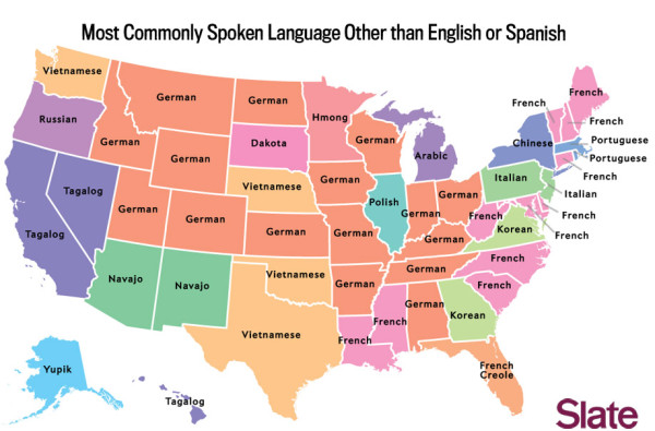
Slate.com published a fun article and set of maps about the languages spoken in the U.S., other than English and Spanish.

One of the maps struck me as somewhat surprising:

CBOX_BlattLanguage_2.jpg.CROP.original-original


Is New York really the only state where Chinese is the most spoken language after English and Spanish? And why no African languages made it to the map?

Being the nerd I am, I looked up the original data from the American Community Survey (the data source referred to in the original article) using Census Bureau’s American FactFinder. And it would indeed seem that the data on the map is (partially) wrong – or at least it doesn’t match the data I could find.

The table below has the correct most-spoken non-English, non-Spanish language (or group of languages) for each state, with the ones that were wrong in the original map highlighted:

Alabama German
Alaska Other Native North American languages
Arizona Navajo
Arkansas German
California Chinese
Colorado German
Connecticut Polish
Delaware Chinese
Florida French Creole
Georgia Korean
Hawaii Other Pacific Island languages
Idaho German
Illinois Polish
Indiana German
Iowa German
Kansas German
Kentucky German
Louisiana French (incl. Patois, Cajun)
Maine French (incl. Patois, Cajun)
Maryland African languages
Massachusetts Portuguese or Portuguese Creole
Michigan Arabic
Minnesota African languages
Mississippi Vietnamese
Missouri German
Montana Other Native North American languages
Nebraska Vietnamese
Nevada Tagalog
New Hampshire  French (incl. Patois, Cajun)
New Jersey Chinese
New Mexico Navajo
New York Chinese
North Carolina Chinese
North Dakota  German
Ohio German
Oklahoma Vietnamese
Oregon Chinese
Pennsylvania Chinese
Rhode Island Portuguese or Portuguese Creole
South Carolina German
South Dakota Other Native North American languages
Tennessee German
Texas Vietnamese
Utah Other Pacific Island languages
Vermont French (incl. Patois, Cajun)
Virginia Korean
Washington Chinese
West Virginia German/French (exact same number of speakers)
Wisconsin Hmong
Wyoming German

What could explain the errors? For starters, I’m probably using at least a slightly different data set from the original author, as I couldn’t find a data that had the “Other” categories broken down in the same level of detail as in the Slate article. (I’m using a data set “LANGUAGE SPOKEN AT HOME BY ABILITY TO SPEAK ENGLISH FOR THE POPULATION 5 YEARS AND OVER, 2008-2012 American Community Survey 5-Year Estimates”, which should be the most reliable current data available on the FactFinder web site.) So if the original article is using older but more detailed data, e.g. from 2005–07, that could explain at least some of the difference.

Another plausible scenario is that Slate uses the wrong data column in the same/similar data set. The data I used includes three values for each language: the total number of speakers, those who “speak English ‘very well’”, and those who “speak English less than ‘very well’”. With a quick glance at the data it seems to me that the original map actually shows the language with the biggest number of those “very well” speaking people, not the total speakers, but I didn’t test this hypothesis thoroughly.

Whatever the problem here, I can’t really blame the original author. The Census Bureau’s several websites are awfully difficult to use, the categorizations used are confusing and the data formats are a mess. It was hard work to simply get the data for all the states and clean it up into a usable format. (Now that I’ve done the job once, you can download the data here in a more user-friendly format if you want to play with it.)

This seems to unfortunately typical of a lot of open government data all around the world. A few magnificent exceptions aside, too much of the world’s open data is in an obscure or messy data format, hidden behind a crappy interface, accessible only to the most dedicated of hacks and wonks. As happy as I am for Gapminder, Google Public Data, and the like, I would rather see governments themselves clean up their act and start thinking seriously about how Joe Public can actually access their data. It isn’t enough that the data exists somewhere in some format. It needs to be accessible for regular people.

Malofiej – just wow!

Just returned home from Malofiej. What a week it has been! I’ll write a more detailed report (in Finnish) next week, but here are some quick thoughts on the event.

First of all: if you mostly work with information graphics, visualization, data journalism etc., you should go to Malofiej, even if you have no works you’d want to enter to the competition. The competition is only a part of it, albeit probably the most famous part. I personally didn’t enter any projects and quite a few other people I talked with were there likewise only, or at least mainly, because of the conference part. Of course the competition is important and the winners are well worth checking out, but for me the presentations by the judges and the networking opportunities were far more important.

(There’s actually a third part besides the conference and the competition: the Show, Don’t Tell! workshop. It is a masterclass type of three-day workshop for infographics professionals to perfect their skills under the guidance of the world’s top experts. I’d really want to take part in the workshop in the future, but this year I simply couldn’t find the time to do so and thus can’t say much about it. Seems it was a success, which is hardly surprising given the caliber of the teachers.)

All in all it was both a very intensive and a very rewarding experience. At first I was somewhat starstruck to be hanging around with all these people whose work I really admire and whose Twitter feeds and blogs I read for inspiration, but practically everybody I talked with seemed to be very down-to-earth and willing to politely listen to the at times incoherent ramblings of yours truly. I made many new friends and was really fascinated to hear informal behind the scenes stories of the daily grind at world class news organizations’ graphics desks. The sheer amount of all the informal goings-on around the main programme combined with some logistic problems (I ended up spending 21 h travelling from Helsinki to Pamplona due to a cancelled connecting flight) meant that I only catched maybe 15 h of sleep between early Tuesday morning when I left home and Saturday evening when I’m writing this post. Add to that the considerable amount of boozing involved, and my hot tip for next year is to rest well before coming to Malofiej and reserve some time after it for recuperation.

As for the conference programme itself, I must really congratulate the organizers for getting together such an interestingly diverse set of judges/speakers. All the presentations were interesting and the best ones were fantastic. Some themes spanning several presentations included the importance of sketching, programming vs. hand-crafting and different narrative formats (linear vs. nonlinear, the role of annotation etc.). More of these in a later post. The works shown were really interesting and showed a wide variety of themes and techniques, which was also great.

To list a few negative things I have to mention keeping schedules and translation. Some of the speakers kept within their alotted time very well, but some were more liberal in their use of time which is a bit unfair towards the other speakers. Basically all the talks were so interesting that they could have filled a longer time slot, but time is a limited resource so if one speaker goes overtime, someone else often needs to cut their presentation shorter. Not nice!

All the talks were either in English or in Spanish (except for one which was half in Spanish and half in Portuguese) and interpreted into the other language. The basic setup with wireless headphones worked reasonably well, but the translators had a hard time at least when translating to English. The impression I got was that something was lost in translation with all the non-English-language presentations. I think a part of the problem may be that the translators (I think there were two) were Spanish native speakers. It probably would work better if Spanish was translated  to English by a native speaker and vice versa. At least that’s how they usually do it in organizations like the EU.

I’ll write later more about the actual awards, but to quickly summarize I think all the gold medal winners certainly earned their prize. I’m slightly disappointed that NYTimes’ 512 Paths to White House didn’t win the Best in Show, but at least it got gold and the NYTimes’ sports piece about hurdles is very well worth the prize, too. Awarding the “best online map” to ProPublica’s StateFace font was an interesting move and certain to create a bit of controversy. The first ever medal (bronze) for a Finnish media was awarded to Hannu Kyyriäinen’s map of shrinking Palestine in Suomen Kuvalehti. Finland even beated our eternal arch-rival the Swedish who this time got no medals. (Personally I think SvD’s graphics should have deserved some, but let’s not go there…)

I highly recommend checking out tweets with the hashtag #malofiej, especially Alberto Cairo’s fantastic coverage.

To sum up, I really enjoyed myself, learned a lot and made new friends and professional contacts. Easily worth the money and time spent. I’m definitely going next year (the dates for 2014 were already announced: 23rd to 28th March) and highly recommend everyone to do similarly!

PS. A minor, but to me an imporant point: Being a “pesco-vegetarian” I did occasionally find it a bit challenging to feed my self in Pamplona. Although many a restaurant offered had a great selection of fish and seafood, many seem to put ham in an amazing variety of dishes, including seemingly vegetarian ones. I hear the local ham is really good, but if you’re a vegetarian – or muslim – I’d be careful. And it would be nice if there was a meatless option for the awards dinner next year. ;)

A misleading chart about Chávez’s legacy

FAIR has an entertaining piece critizising AP’s treatment of the late Venezuelan president Hugo Chávez. While I have some serious misgivings about the tendency of some left-leaning writers to skate over the awful human rights record of the Chavéz regime just because he was seen as a counterweight to the United States’ economic and foreign policy, it is certainly true that spending oil revenues on social programs instead of skyskrapers or museums is a sensible choice for a country like Venezuela. However, I take issue with the use of graphics in the FAIR article.

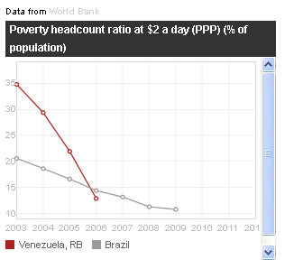
Accompanying the story is a graphic comparing the number of people living in poverty (defined here as a daily income of less than $ 2 at purchasing power parity) in Venezuela and Brazil:

Why is the vertical scale truncated at 10 %? And more importantly, why does the x-axis start at 2003? President Chávez took office in 1999 so wouldn’t that be a more relevant starting point? (I know the short answer to these questions that the graphic is a screenshot from World Bank’s website, but I still think it’s sloppy journalism to cut corners like this when it would have taken 5 minutes to download the relevant data and do the graphic in Excel.)

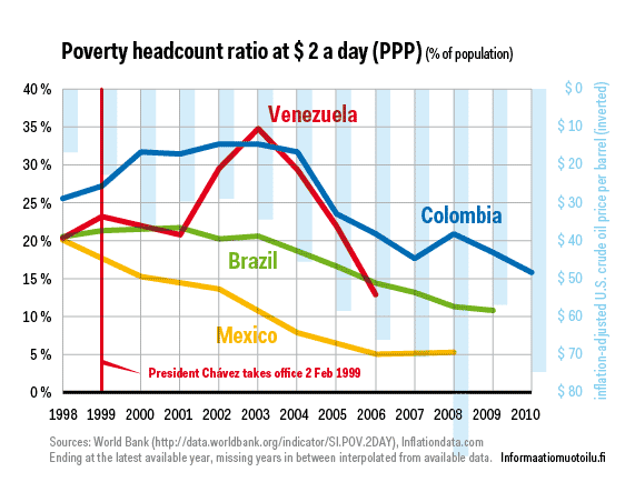
I downloaded the same World Bank data and did the graphic below, starting from 1998, a year before Chávez took office. I also added the data for Colombia and Mexico. I also added the data about U.S. oil price in real (inflation-adjusted) dollars per barrel as an inverted bar chart on the background to give context.

The World Bank data is somehat patchy, but by connecting the data points we have an interesting picture appears. In 1998 Brazil, Mexico and Venezuela had the same share of population living in poverty at roughly 20 %. In Colombia the share was some 7 percentage points higher. In the newest available data Brazil and Venezuela are roughly on par and Colombia is still trailing the two by the same amount as in 1998, whereas Mexico clearly has broken off the pack. Venezuela’s progress seems to be tracking the oil price curve whereas Mexico and Brazil show steadier, if less dramatic progress towards lower poverty rates.

The moral of the story is that it’s often possible to frame the data so that it supports your claim, whether true or not. Stepping back and showing more gives the audience the chance to judge for themselves. In this case it would seem that Venezuela did indeed make significant progress in reducing poverty during Chávez’s reign, but so did other oil exporting Latin American countries. Venezuela no more looks exceptional when showing a more complete set of data.

Can election results be predicted from the voters’ musical preferences?

The answer is probably: no. But that has not stopped me from creating this tongue-in-cheek analysis of the U.S. presidential election for Basso Magazine.

(Click on the picture to enlarge.)

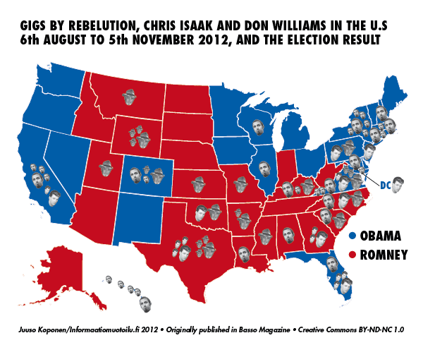
Using a complicated and very unscientific method I calculated how well gigs played by artists touring the U.S. in the three months leading to the election predicted the result of each state. I scraped the concert data from Eventful.com API and cross-referenced that with the state-level election results, taking into account the margin of votes by which each state was won as well as the total number of concerts played in each state.

The index number for each artist was calculated by dividing the margin of win (in absolute votes, positive if for Obama and negative if for Romney) by total number of gigs in each state and awarding this number for all the artists who played a gig in the state. If an artist had more than one gig in a state, the second gig yielded only half of the index points, the third gig one third etc.

To feature on the final graphic the artist had to play gigs in at least ten states or states in which a total of 50 million votes or more were cast. More than one thousand artists qualified even with this limitation, so in the central part of the graphic only a select 70 artists are shown, chosen by their poplularity in Finland where the magazine is published. The final graphic was created in Nodebox and then finalized in Adobe Illustrator.

The artist who best predicted an Obama win was the reggae band Rebelution, whereas a Romney win was best predicted by a gig by the country singer Don Williams. The artist who least predicted win for either was Chris Isaak, probably best known for his 1990s hit ”Wicked Game”. The map below shows the gigs played by these three artists by state in the three months before the election.

(It should be noted that such apparent correlation is not an indication of the political preferences of the artists in question themselves. For example, a gig by Meat Loaf, who is a Romney supporter did not predict a win for Romney, whereas a gig by Weedeater did.)

What did we learn from all this? Probably not much – except I personally did learn quite a bit about data scraping! It was a fun excercise and I hope our readers know a little bit more about U.S. politics than they did before this. And just sayin’, but Nate Silver should maybe keep his eye on Rebelution and Don Williams in 2016! ;)

A little tool for making pictorial unit charts in Illustrator

Pictorial unit charts, like the ones Isotype made famous, is a nice alternative to conventional bar or area diagrams. However, actually making them if you’re working in Illustrator can require a good deal of handiwork and you might easily end up with the wrong amount of little guys when copying and pasting.

To make desinging pictorial unit charts a bit simpler I ended up writing a little snippet of JavaScript code that works with the neat Illustrator plugin Scriptographer. We decided to share it here, as some of our readers might find it useful.

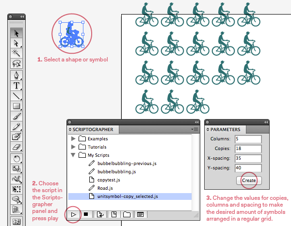
Download unitsymbol-copy_selected.js here. When you first start Scriptographer, you will be presented with a dialogue window asking you to choose a folder for your own scripts. Put unitsymbol-copy_selected.js in that folder, so that Scriptographer can find it. Note that this is a very quickly made tool without much finesse, so feel free to improve! Anyhow, here’s how it works:


1. First you select a shape or symbol that you want to multiply (it also works with groups). I find working with Illustrator’s symbols to be very useful, since then it’s easy to change all individual instances of the same symbol at once when you update your unit figure after making a hundred copies.

2.Choose the script in the Scriptographer panel and press the play button to activate it. If you want to have a look at the code, just double-click the name of the script.

3. A dialog called Parameters appears. Here you set the number of columns and copies of the symbol (the value you will visualize). X- and Y-spacing are measured in points from the bounding box of the symbol, so if you want  squares of 10 pt with 2.5 pt spacing between them you input 2.5 in the X- and Y-spacing fields.

Press create and you’ll see the specified amount of copies appear next to your original ‘source’ symbol.

Todos concerning the usability would be to have it accept different units for the spacing, and maybe it should also to give a choice of where to place the symbols. If one would want to make it really clever one would make it possible to update the parameters of created charts, but I suspect that might require writing a whole new plugin, so that’ll be something for another day.