FAIR has an entertaining piece critizising AP’s treatment of the late Venezuelan president Hugo Chávez. While I have some serious misgivings about the tendency of some left-leaning writers to skate over the awful human rights record of the Chavéz regime just because he was seen as a counterweight to the United States’ economic and foreign policy, it is certainly true that spending oil revenues on social programs instead of skyskrapers or museums is a sensible choice for a country like Venezuela. However, I take issue with the use of graphics in the FAIR article.
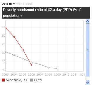
Accompanying the story is a graphic comparing the number of people living in poverty (defined here as a daily income of less than $ 2 at purchasing power parity) in Venezuela and Brazil:

Why is the vertical scale truncated at 10 %? And more importantly, why does the x-axis start at 2003? President Chávez took office in 1999 so wouldn’t that be a more relevant starting point? (I know the short answer to these questions that the graphic is a screenshot from World Bank’s website, but I still think it’s sloppy journalism to cut corners like this when it would have taken 5 minutes to download the relevant data and do the graphic in Excel.)
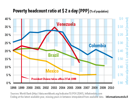
I downloaded the same World Bank data and did the graphic below, starting from 1998, a year before Chávez took office. I also added the data for Colombia and Mexico. I also added the data about U.S. oil price in real (inflation-adjusted) dollars per barrel as an inverted bar chart on the background to give context.

The World Bank data is somehat patchy, but by connecting the data points we have an interesting picture appears. In 1998 Brazil, Mexico and Venezuela had the same share of population living in poverty at roughly 20 %. In Colombia the share was some 7 percentage points higher. In the newest available data Brazil and Venezuela are roughly on par and Colombia is still trailing the two by the same amount as in 1998, whereas Mexico clearly has broken off the pack. Venezuela’s progress seems to be tracking the oil price curve whereas Mexico and Brazil show steadier, if less dramatic progress towards lower poverty rates.
The moral of the story is that it’s often possible to frame the data so that it supports your claim, whether true or not. Stepping back and showing more gives the audience the chance to judge for themselves. In this case it would seem that Venezuela did indeed make significant progress in reducing poverty during Chávez’s reign, but so did other oil exporting Latin American countries. Venezuela no more looks exceptional when showing a more complete set of data.

