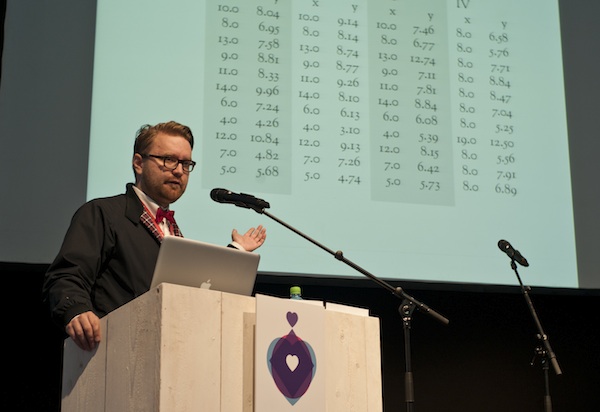
Some of our readers know that we run an information design course at Aalto University each year. It’s organized by the graphic design department, but enrollment is open to all Aalto students. We typically have a slight majority of graphic designers and a growing number of technology students participating. I think a mixed group such as this is what Aalto’s founding group had in mind. All we need now are a few business students to participate in the next course and we’ll boast one of the most diverse groups in the whole university.
We see lots of interesting student works on the course each year, but apart from outside guests to the review sessions, very few people ever get to see them. Here are some examples that I split into two separate posts according to the assignment.
Improve Wikipedia!
Jonatan, Juuso and I have been involved in the Finnish open knowledge community, a budding movement to engage citizens and officials in a drive to open government databases and increase the amount of information that’s freely accessible to the public. The Open Data Kitchen is part of it, but we also take part in other ways.
I was recently made president of Wikimedia Suomi, a small local chapter of the organization that promotes Wikipedia, the free encyclopedia. One of its goals is to get experts and advanced students to participate in editing Wiki articles. Getting text contributions is usually no problem, but the quality of information graphics is far behind that of the articles themselves. We thought we’d help by giving the students in our course an assignment to design new visualizations or to redesign existing ones. To narrow the scope a little, all the articles they’d work on would be related to economics.
Showing how the Gross Domestic Product and national population figures line up in European countries. Countries that are relatively poor have population stacks that flow over the GDP bar. Work by Karoliina Liimatainen, Aalto University School of Science and Technology.
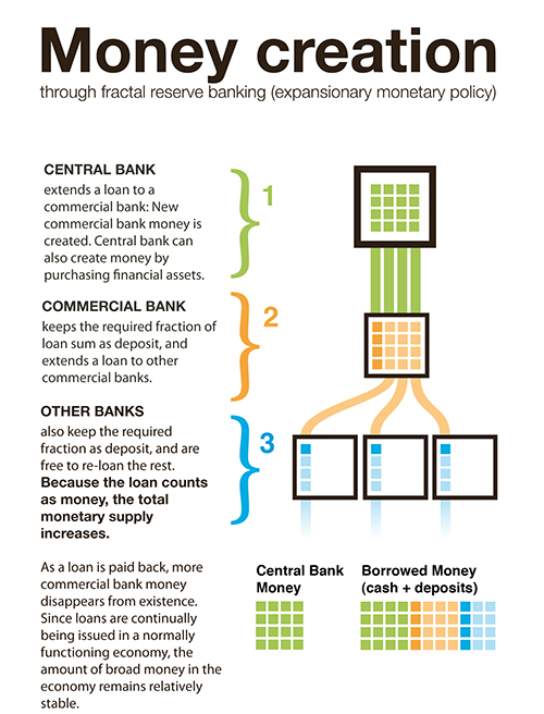
A diagram by Anssi Kokkonen illustrating the way money is released into the economy.
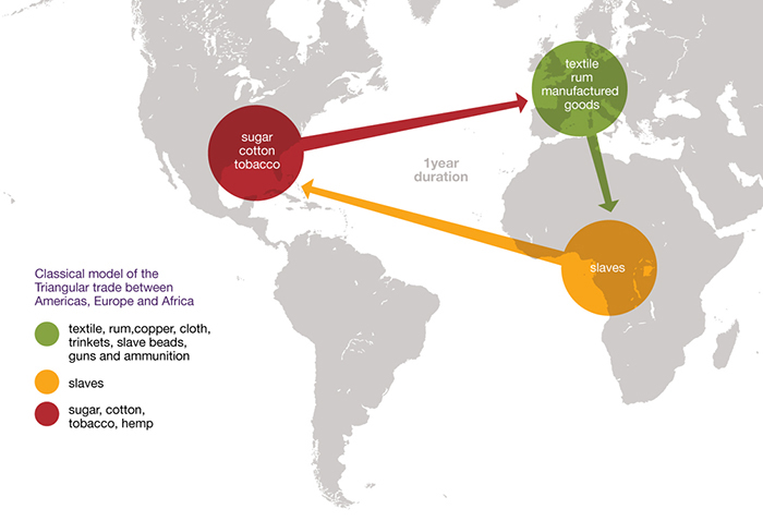
Sasa Kerkos designed a simplified diagram of the Atlantic slave trade.
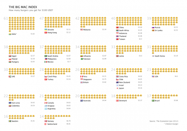
The Big Mac Index is a popular and intuitive tool for many things. For one, it gives you an idea if a currency is over- or undervalued. This visualization shows how many burgers you get if you spend a hundred bucks. Work by Antti Vuorela, Aalto University School of Science and Technology. (click to enlarge)
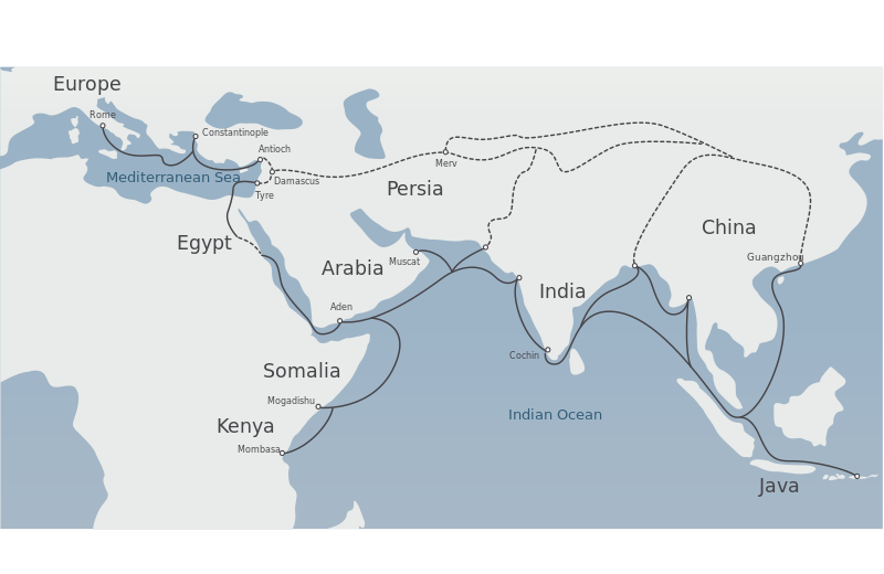
A simplified map of the legendary Silk Road. Work by Jutta Joutjärvi.
An experimental way to visualize the Gini coefficient (a measure of income disparity) and GDP per capita. Work by Vahid Mortezaei.
