 Juuso Koponen")
In Finnish: Suomennamme tämän artikkelin myöhemmin blogia varten, tässä se on englanninkielisenä siinä muodossa kuin se esitettiin aiemmin tänään PICNIC-festivaalilla.
We were asked to do a short (20 min.) presentation about what visualization is and why it matters for Open Data Breakfast at PICNIC Amsterdam. You can download this presentation as a pdf here, annotated with the text of the presentation as comments, or if you prefer, read the full text below.
edit (September 27th 2011): The same presentation was given at the IBM Smarter Cities Challenge workshop at Aalto Design Factory yesterday, where it was recorded and is now viewable online:
* * *
I’ll start with a quick definition of what we’re talking about here. We ourselves usually use these three terms more or less interchangeably:
• information design
• visualization
• infographics
There is a slight distinction: information design is an active pursuit to make information more understandable. The German word for design, “Gestaltung”, roughly translatable as “to give a form to something” I think captures this idea better than the English “design”.
Information design, therefore, is giving the information a form. In the widest sense this need not necessarily be a visual form, although information design does mostly concern itself with the visual presentation. But I would say, that for example, what the design consultancy Siegel+Gale does when they simplify things such as this credit card agreement here, is information design, too.
Visualization is a slightly narrower pursuit, strictly concerning with the visual presentation of data. Infographic is a narrower concept still. It is what may or may not be the end result of an information design or visualization process, a specific end result, a piece of graphics presenting data.
For many in the scene, these distinctions are a lot more clear cut and they would strongly disgree to equating them to the extent I’m doing here. During this presentation, I will use them more or less interchangably. I hope I’m not stabbed to death afterwards.
What then, exactly is visualization, or visual information design, if you prefer? Visualization researcher and blogger Robert Kosara defines it like this:
• based on non-visual data
• produces an image
• readable and recognizable
So first of all, visualization is all about presenting data, and more specifically data that is not inherently visual, or at least can’t be seen with a naked eye or photographed, such as the inside of a living human body. Second, visualization means producing an image and using that image as the primary means of communication. And third, it must be readable and recognizable. That is, the visualization should show something most of the audience doesn’t already know and in a way that is understandable, preferably intuitively so, ruling out data art.
The term “information design” was coined by Pentagram Design in the 1970s. Although the term is relatively new, the “genres”, so to say, of information design are a lot older, even if they weren’t always thought of belonging to the same discipline. These genres include maps, statistical graphics, various kinds of scientific visualizations, wayfinding tools such as signage, navigation tools or region identification systems, “info-illustration” such as technical drawings and cut-out pictures, and more.
* * *
Why do we need visualizations then?
Sight is our strongest sense. The throughput of the visual sensory system has been estimated at ten million bits per second, an order of magnitude or several higher than the capacity of the other senses. Although raw sensory throughput is not the same thing as what gets consciously processed in the brain, it is clear that sight is our primary mode of percieving the world around us. We understand visual intuitively, whereas the same information presented visually usually must be decoded before we “get” it. Philosopher Paul Valéry puts it like this:
“Seeing is forgetting the name of the thing one sees.”
Several studies show that we remember things better when they are presented visually, as opposed to verbally, and even better when both modes of presentation are used. Therefore it comes as no surprise that pictures have been used to aid recollection long before the invention of writing. In fact, alphabetic writing grew out of pictorial symbols used for such a purpose, and some writing systems, such as the Chinese characters, still retain some pictographic aspects.
Natural languages are linear by their nature. This is especially true of spoken word, but applies to writing too. The order in which subject matter is presented in a text is decided by the person who wrote it, whereas a visual presentation gives control to the viewer, who can go through the content in whichever sequence and extent works for them.
And of course there are things which are near impossible to explain in writing, but easily understood as a picture.
So, pictures clearly serve an important function in communication. But what advantages are gained by leaving the domain of lifelike pictures such as photographs, for the more abstract visual presentation style of infographics?
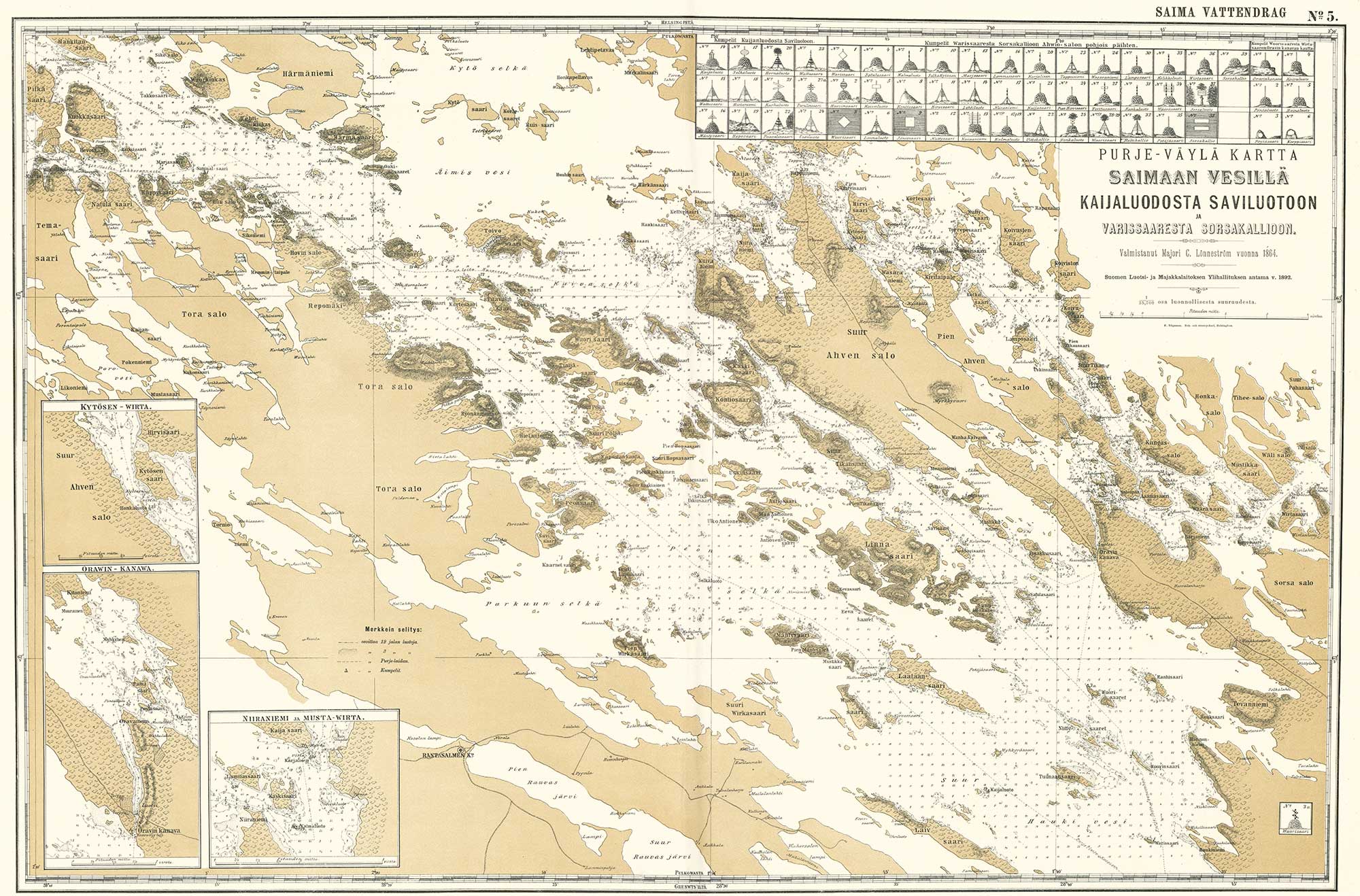
First, consider how the main modes of visualizations, such as this map here, work. The difference with the annotated aerial photo next to it, is that it contains less information than the photo, which has information about things like roof materials and parked vehicles. But for most users, this extra data is useless, and in fact hinders their perception. By removing the uninteresting information from the picture, the map gives more prominence to what is left in.
Here we have a bar chart, or more accurately, a meaningless rectangle posing as a bar chart. Visualizing a single number like this serves no purpose whatsoever. We can add a second bar, so it makes a little sense, but still this tells us little more than a simple sentence “X is twice the amount of Y” would. But when you add more bars, it becomes more interesting. With two bars there is just one comparison to be made, between X and Y. With three, there’s three: between X and Y, Y and Z and X and Z. With four, there’s six, with five, it’s ten. Ten bars facilitates 45 pairwise comparisons, not to mention that visual patterns begin to emerge, such as that these here form a group distinct from the others, and so on.
So, the main modes of how visualizations, as opposed to lifelike pictures work, are by:
• reducing the data for emphasis, and
• juxtaposing the data for comparison
Then the main functions of visualization:
• convey information
• guide action
• influence decision-making
• analyze data
What do I mean by these? The first one is pretty straightforward. Quite often it’s easier to get an idea across visually than verbally. This is what, for example, newspaper graphics are all about. Guiding action is a special case of that, directly connected to something the viewer wants to do, or that we want them to do. Assembly instructions would be a typical example, or signage. Influencing decision-making happens when the information conveyed is persuasive enough to influence decisions taken. A good executive summary is visual, not text-heavy.
Analyzing data, I think, is the most interesting aspect of visualization. We humans are very good in percieving patterns visually. Take these four data sets, known as the Anscombe’s quartet. It’s pretty hard to say much about them by just looking at numbers. Even many of their mathematical properties happen to be identical. But when we plot them visually, it becomes immediately clear that they have interesting properties that are not immediately obvious from the numbers alone.
So, a visualization can reveal us something we didn’t know ourselves when we started to plot the data. Here’s an example. I was interested in how weather conditions might affect the number of car accidents. I plotted a variety of weather data from two different provinces in Finland against the accident data from the same year and same place. None of it looked very promising until I happened to plot the amount of daylight, which in Finland varies a lot from winter to summer. I’m not showing you exact numbers or anything here, because the quality of the data I had is not good enough to really make conclusions, this is just to demonstrate the basic principle.
So, I started to think, hmm, these graphs look a bit like upside-down versions of each other, what would happen if I flipped these over and then overlaid them? They fit quite nicely, except that they’re a bit off. But if we offset the sunlight graph by a month like this, the fit is almost perfect. If the data was good enough, I would say this suggests a correlation between the number of accidents and the change in, as opposed to the absolute amount of, daylight. The number of accidents starts rising in the autumn when the amount of light decreases, maybe because drivers adjust slowly to the more challenging driving conditions? Whether it is really true is hard to say, because of the poor data, but it’s an interesting idea maybe worth further research, and one that was not obvious by just looking at the numbers.
* * *
A few words about different visualization philosophies. Deep divides exist within the wide field we call here “information design”. We can roughly describe this as:
“Statistical graphics vs. Everyone else”
The history of statistical graphics starts with the late 18th century economist William Playfair who invented the line graph, the bar chart and the pie chart. After a few additions such as the scatterplot and the histogram, the bulk of the statistical graphics toolkit was in existence by the beginning of the 20th century. A few additions were made after World War II by John Tukey and others, but in essence most of statistical graphics works with a limited, but thoroughly tried and tested palette of tools.
The statistical graphics school of thought, nowadays most prominently advocated by professor emeritus Edward Tufte, views its audience as intelligent, insightful and interested in the data on display, willing to spend time exploring the intricacies of the presentation. It emphasizes methodologically consistent presentation using established coding systems, neutral point of view and a cool, minimalist visual style, lashing out against “chartjunk” and low “data–ink ratios”, in Tufte’s terms, to the point of often seeming unwelcoming or boring to the casual reader.
In 1920s Germany a completely different approach gained ground. The ISOTYPE movement, founded by the philosopher Otto Neurath, has since proven hugely influential, especially in newspaper graphics. Neurath called his method “pictorial statistics”, but the ISOTYPE approach is nearly a polar opposite of what the “Tuftean” school advocates. Its roots lie in the socialist workers’ education movement. Neurath’s aim was to help the uneducated and often uninterested masses to understand the world around them by producing visually appealing and easy to understand data displays that were originally presented in display windows on the street and as travelling exhibitions. The premise is that the viewer must be lured in and the data must be presented in the simplest possible form, even at the cost of accuracy. Neurath was not afraid of being partisan in his selection of the data to be presented: whatever best made his point was shown, and data diluting that point was often left out. ISOTYPE was a major influence on Fortune magazine, one of the first news publications to extensively use infographics. Fortune in turn influenced Time, Newsweek, St. Peterburg Times and other pioneering American newspapers and magazines, whose influence again spread the ISOTYPE approach to graphic presentation to news media all around the world.
With the advent of computer graphics, a new school of visualization has gained traction. “Infovis” is the term that is, often disparagingly, used to describe the group of novel, often interactive data visualizations that have appeared in the past 20 years. This is maybe what you in the audience, this being the PICNIC festival, most closely associate with the term “visualization”. Infovis can be seen as an outgrowth of the ISOTYPE movement, as it also puts huge emphasis on luring the viewer in with a striking presentation and crafting the visual according to the task at hand instead of relying on a limited palette of tools like the Tuftean school usually does. Many prominent names in this camp, such as David McCandless who runs the blog Information Is Beautiful, also work with ISOTYPE-like visualizations. Infovis differs from ISOTYPE philosophy in at least one crucial way, however. The ease of understanding is not usually the first priority, and infovis presentations can be visually intricate to the point of being so hard to decipher that they would sometimes better be classified as data art.
All these philosophies have their strong points and weaknesses. We personally think that the debate over the merits of a particular school of thought over another is a bit sterile, as we should rather try to find solutions that bridge the trenches to get the best of all worlds: the integrity, clarity and neutral point of view of statistical graphics combined with the ease of understanding and visual appeal of ISOTYPE and the power of innovation, interactivity and automation offered by infovis. The question of esthetics and style remains of course, but we believe it is one that should be addressed according to the needs of the audience and context, not by personal preference or the inherent limitations of the tools used. Certainly all this is easier said than done, but it is an aim to strive for.
* * *
So, to wrap it up: information design is a tool, or a toolkit really, to make our world more intuitively understandable. It serves a wide variety of specific purposes as well as audiences, from illiterate to academic. There are no universal solutions that work for all data, all audiences or all contexts. Visualization is not an exact science, although science, for example gestalt psychology, can tell us much about what kind of visual solutions might do the trick.
Information design is a way of thinking, not a visual style. You often see things like this, that use the clichéd visual style of infographics, but are just pretty pictures, or worse, visual puzzles. What does this “visualization” really tell us that a simple numerical table, or a few bar charts couldn’t have? Infographics should make the viewer feel smart because they learn something new, not stupid because they can’t decipher the visual puzzle. to quote the artist Ad Reinhardt: “As for a picture, if it isn’t worth a thousand words, the hell with it.”
We strongly believe reading and creating visualizations is quickly becoming an essential skill for all knowledge workers. This is especially true of scientists, engineers, journalists and teachers, but also of political activists, middle managers, lawyers and even doctors, to name just a few of the professions that would benefit from using more visualizations. With tools like Mathematica and Google App Inventor even fields as abstract as mathematics and programming are becoming increasingly visual. Even people who don’t create visual presentations themselves should have a degree of visual literacy required to be able to see when a visualization distorts the data by accident – or by purpose. Think about visualization like writing. Although our society provides plenty of work for professional writers, no one thinks basic writing skills shouldn’t be taught to everyone. So it should be with information visualization as well. Thank you.
4 Replies to “Presentation: What is visualization?”